This mook’s got nuthin’ to say. Iron Man 2 trailer looks a-okay though. I do like Iron Man’s classic armors infinitely better than anything he’s worn since 1992.
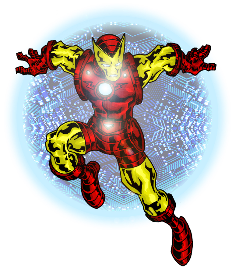
That armor shines! Nice color work sir. I agree that the pointy mask is always sweet. And for the record my personal favorite Iron Man armor was that black suit. I just remember an issue I read when I was a kid where he put on this bad ass black armor and dove into the ocean or a river or something. Loved it!
Eric Shonborn on February 24, 2010 at 7:15 pm Author

3 comments
I’ve always liked that costume. I think it’s the pointy mask. The Secret Wars figure was cool, but it needed the pointy mask.
That armor shines! Nice color work sir. I agree that the pointy mask is always sweet. And for the record my personal favorite Iron Man armor was that black suit. I just remember an issue I read when I was a kid where he put on this bad ass black armor and dove into the ocean or a river or something. Loved it!
Author
Bad ass black armor? The Stealth Armor or the War Machine armor?