
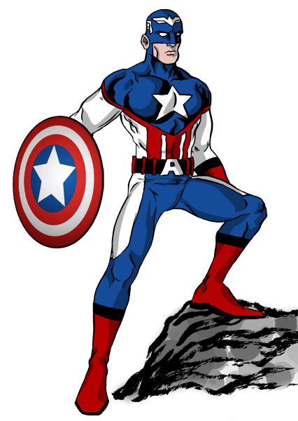
The problem with redesigning Captain America is that every variation of a patriotic superhero has pretty much been done. That and everytime Cap has been redesigned, it’s usually not for the better. This is definitely not an improvement. But I like an old-school cap when artists would hint at the scalemail armor instead of drawing every individual scale. I like the flared gloves and swashbuckler boots. I like the lack of a utility belt.
But what the fuck do I know?
3 comments
Yeah, it’s nigh impossible to improve on the classic Cap costume… but I do like what you’ve done with his stripes. The brushwork on that rock is sweet too.
Oooo! You went with the Liefeld-era head logo!!! I’m a big fan of that one. I think the A is really corny.
Author
I prefer the “A”, but I think the eagle gets an undeserved bad rep. Probably just due to the Liefeld connection.